(If you’re familiar with the preferential voting system, click here to skip to the widget)
Often, there’s a lot of focus on the final result of a particular election – who won, and by how much. This is typified by the two-candidate-preferred (2cp), which is the share of the vote for each of the final two candidates after preferences. However, sometimes the eventual winner in an electorate can be much closer to being eliminated or being defeated on preferences than their final 2-candidate-preferred might suggest.
Under the preferential voting system, voters rank the candidates on their ballot in order of which ones they prefer to be elected first. For example, let’s say we had four candidates running in an electorate, from the Labor, Liberal, National and Democrat parties.
A hypothetical voter might prefer that the National candidate is elected first of all, but if the National can’t win, they would prefer that the Liberal is elected, and then prefer the Democrat candidate over the Labor candidate. This voter would fill in their ballot as such:
- FLUGGE, Trevor
NATIONAL - TUCKEY, Wilson
LIBERAL - PEEBLES, Shyama
AUSTRALIAN DEMOCRATS - CHANCE, Kim
AUSTRALIAN LABOR PARTY
In a Legislative Assembly (the lower house, where government is formed) election, all ballots are first processed and counted, and a primary vote (or first-preference vote) tally produced. This refers to the % of voters who put one party first. For example, if one in five voters put the National candidate first, then the National Party would have a primary vote of 20%.
Once all ballots have been processed and counted, the candidate with the lowest primary vote is sequentially eliminated, and their voters’ ballots will be transferred to their next preference. For example, let’s say that in this election, each party has a primary vote of:

The Democrat candidate will be eliminated first, and their votes transferred to each voter’s second preference. For simplicity’s sake, let’s assume that half of Democrat voters placed Labor 2nd, while a quarter each placed the Liberal and National candidates second.

Note that in the lower house (the Legislative Assembly), this is entirely controlled by who the voters place second on their ballot – candidates and parties do not have any control over where preferences go. A party or candidate may recommend preferences using how-to-votes and other material, but where the ballot travels next is entirely up to the voter.
You may occasionally hear of “preference deals” and “(party) directs preferences to (party)” in the news or other media. In the Legislative Assembly, this only refers to the parties’ ability to recommend that their voters put Party A over Party B. If a voter decides to ignore this recommendation and preference Party B over Party A, their ballot will go to Party B’s candidate at full value.
(This is different in Victoria’s upper house, the Legislative Council. There, if you vote 1 for a party, that party gets to decide who your preferences go to after them. Your preferences are only respected in the Legislative Council if you vote below the line (i.e. number candidates for the party).)
The proportion of primary votes for a certain party which are then transferred to another party is also known as the preference flow. In this case, the preference flow for Democrat votes would be 50% Labor, 25% Liberal and 25% National.
While preference flows are referred to as percentages, note that in the Legislative Assembly, there is no partial vote transfer. If you hear that the preference flow from the Greens to Labor is 80%, that doesn’t mean that 80% of each Green vote goes to Labor. It means that four of five (80%) Greens voters put the Labor candidate ahead of the other candidate on their ballot, while one in five (20%) put the other candidate ahead of Labor.
Preference flows are a useful way to calculate the outcome of a preferential-voting contest. For example, if I told you that in an election, Labor won 48%, the Liberals won 32% and the Nationals won 20%, if you know what the National -> Liberal preference flow is, you can calculate the final Labor-versus-Liberal result in that election.
Speaking of which, let’s finish our example preferential-voting election. As the National candidate has the lowest vote share of the remaining candidates, he is eliminated. Since our hypothetical voter from earlier voted 1 National 2 Liberal, their vote is then transferred to the Liberal. Had they instead voted 1 National 2 Democrat 3 Labor 4 Liberal, their vote would instead be transferred to Labor (as the Democrat candidate has already been eliminated).
For simplicity’s sake, let’s assume that 80% of all voters who voted 1 National or 1 Democrat 2 National then places the Liberal candidate over the Labor candidate.

The vote shares of the final two candidates is often referred to as the two-candidate-preferred, or 2cp for short. It is sometimes also referred to as the two-party-preferred; however this can be confusing as the two-party-preferred is often also used to refer to the share of voters who preferred a Labor candidate over a Liberal/National Coalition candidate, even in seats where a minor party or independent candidate made the final two.
As an example, we can consider the division of Macnamara at the 2022 federal election. Once all other preferences were distributed, the final three candidates in Macnamara were:

As the Green candidate placed third, they were eliminated and their voters’ preferences distributed to give a final 2cp of Labor 62.25%, Liberal 37.75%. On that basis, Macnamara is often classified as a “safe Labor seat” on the classic two-party pendulum. However, a cursory look at the above figures show that Labor very nearly got knocked out of second place by the Green candidate, who would have won the seat on Labor preferences.
For another example, let’s look at the district of Melton at the 2018 Victorian state election. After preferences had been distributed, the final three candidates in Melton were:

The independent Ian Birchall narrowly placed third with 26.4% and was eliminated from the count, with two-thirds of his voters’ preferences going to the Liberal candidate for a two-candidate-preferred of Labor 54.29%, Liberal 45.71%. However, a small Liberal-to-Independent swing would have changed the matchup from Labor-Liberal to Labor-Independent; in this scenario, it is possible (though unlikely) that Labor would have lost the seat as Liberal voters’ preferences would have flowed more strongly against Labor.
All this to say that sometimes, an electorate which looks safe on a 2-candidate basis may look a lot closer once you look at factors such as the margin of the candidate in 2nd over the candidate in 3rd and the preference flows of each candidate. For this purpose, it can be useful to look at the vote share of the final three candidates after preferences, referred to here as the 3-candidate-preferred to see if the electorate was very close to having a different final two matchup (e.g. Liberal vs Green in Macnamara 2022, instead of Liberal vs Labor).
Hence, it can be useful to look at the 3-candidate-preferred (3cp), or the share of the vote + preferences of the final three candidates. This tool allows you to explore the 3-candidate-preferred of each electorate at the 2018 Victorian state election; note that preference counts were not undertaken in some electorates and hence the 3-candidate-preferred figures for those districts are estimates only (the full methodology used to produce those estimates is available here):
Estimating the 3-candidate-preferred
In some electorates, a candidate either won a majority (>50%) of the first-preference vote or ended up with a majority before the count was reduced to the final three candidates. The Victorian Electoral Commission (VEC) did not perform a full distribution of preferences for those electorates and hence they have been marked as either having no distribution of preferences or incomplete distribution of preferences.
For these electorates, I have performed my own distribution of preferences from wherever the VEC left off using preference flows in similar situations. So for example, in the district of Buninyong, Michaela Settle (Labor) won a majority of the vote with four candidates left:
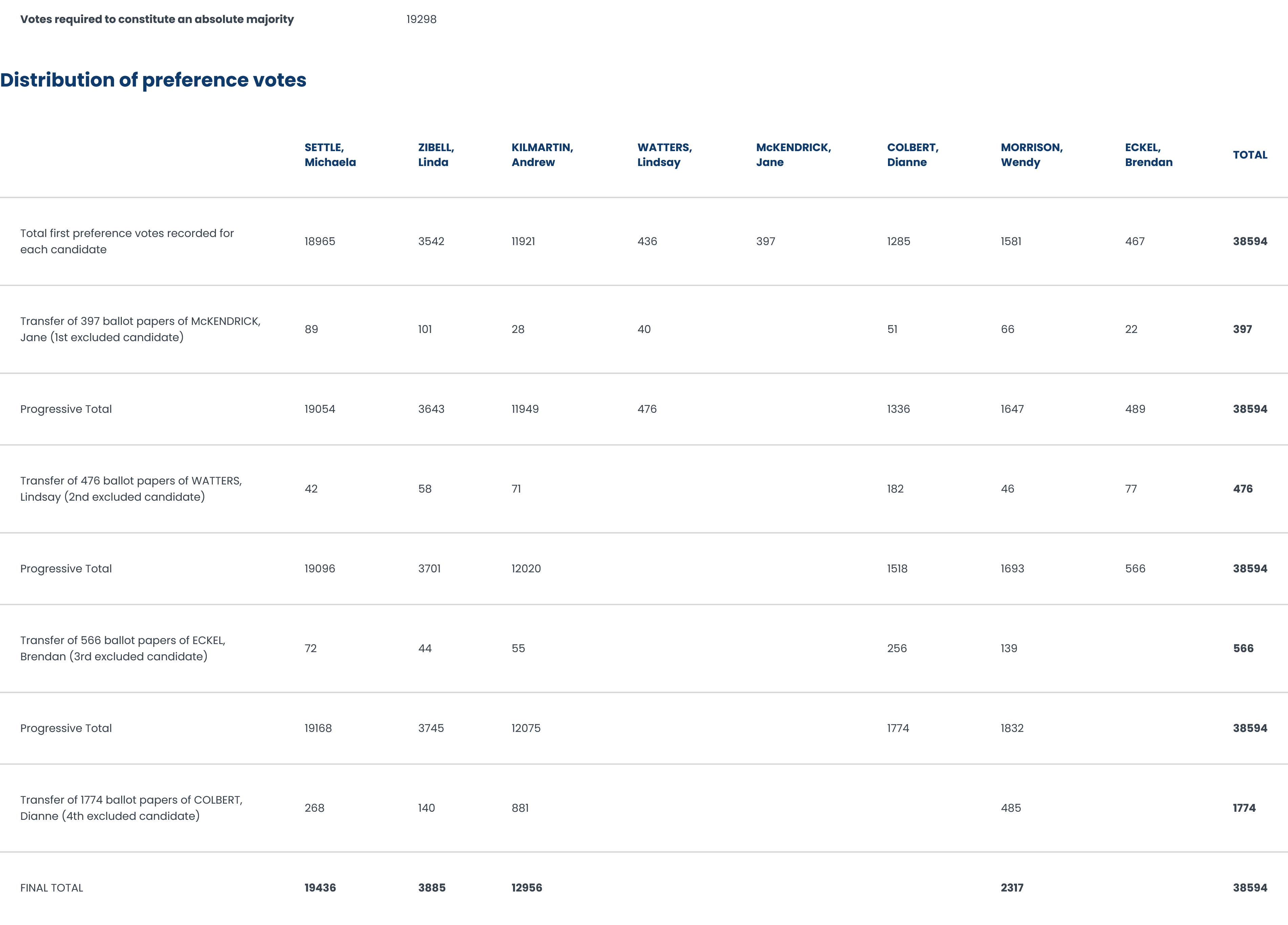
As Wendy Morrison (AJP) had the lowest votes + preferences at this point in the count, if the count had proceeded, their 2317 votes would have been redistributed to their voters’ next preference. Since we don’t know what the preferences actually are, I look at electorates where an AJP candidate was eliminated and their votes redistributed to Labor (Settle), Liberal (Kilmartin) and Green (Zibell) candidates. Using a model of the ratio of preference flows between each party, I estimate a preference flow from Morrison to each of the remaining candidates and “redistribute” Morrison’s votes accordingly. This process continues until only three candidates remain, at which point I can calculate the 3cp estimate (full details up here).
Electorates whose 3cp figures have been estimated in this manner have a warning attached to the 3cp pie chart. This warning either states that the 3cp figures are:
- Completely estimated using preference flow data from other electorates, which refers to electorates where one candidate won an outright majority of the first-preference vote and hence the VEC did not undertake any distribution of preferences (e.g. Malvern 2018). The 3cp estimates for these will be less reliable (especially where there’s multiple independents running) as there is more uncertainty regarding the final three candidates and the possibility of inaccuracies compounding.
- A partial estimate using preference flow data from other electorates, which refers to electorates where no candidate won >50% of first-preferences, but ended up with >50% of the vote after preference distributions with more than 3 candidates remaining (e.g. Buninyong 2018). By coincidence, all three such electorates at the 2018 state election had 4 candidates remaining and therefore we know who’s in the top three. The 3cp estimate for these electorates are probably quite accurate as there’s no uncertainty as to which three candidates made the cut and there’s only one distribution for any inaccurate distributions to impact.
Explanation of the shading options:
- Winning party: electorates are coloured by the party or grouping of the member who was elected to represent it at the 2018 state election e.g. the district of Bayswater was coloured in for the Liberals. Electorates where the 3cp estimate presented is my own have diagonal shading.
- 3rd-placed party: electorates are coloured by the party or grouping of the member in 3rd place after preferences were distributed, e.g. the district of Gippsland East was coloured in for the Greens due to my model suggesting they would overtake the LDP once preferences were distributed. As a sanity check on whether this is realistic, we can look at a few factors:
- What was the margin between the Green and the LDP candidates on first preferences? In this case, the Green won 6.21% versus 6.34% for the LDP – definitely a surmountable margin via preferences.
- Are there enough preferences for the Green to plausibly overtake the LDP? The three independents in Gippsland East combined for 9.01% of the first-preference vote – hence the Green needed to receive just 1.5% more of the independents’ voters’ preferences than the LDP candidate to overtake them.
- What are preference flows to Green and LDP candidates like? At the 2018 state election, preference distributions from Independent voters to Green candidates ranged from 2.53% (Sindt, Morwell) to 43.79% (Crook, Monbulk) in Eastern Victoria (average 18.2%). While I could not find preference distributions to the LDP in Eastern Victoria, the preference flows from Independent voters to the LDP at the 2018 election ranged from 1.6% (Anderson, Brunswick) to 13.39% (Hanlon, Melbourne). Hence, we would expect Independent voters in general to preference Green candidates at higher rates than LDP candidates.
- Margin between 2nd and 3rd placed candidates: electorates are coloured based on the gap between the 2nd and 3rd-placed candidates after all other preferences were distributed. e.g. in the district of Geelong, independent Darryn Lyons placed 2nd with 27.21% of the 3cp and the Liberal placed 3rd with 22.38% of the 3cp; hence the gap would be calculated as 27.21% – 22.38% = 4.83%. Effectively, this is one of the ways to estimate how close this district came to having a different final-two matchup. It’s worth noting that there are cases where the candidate in 4th could have beaten the candidate in 2nd if they had overtaken the candidate in 3rd; in those cases the most important factor in determining the final-two matchup is the margin between the candidates in 3rd and 4th.
This is why I describe the margin between 2nd and 3rd place as just one of the metrics of how close a seat was to getting a different matchup. - How close a crossbench candidate was to the final two: if a crossbench (minor party/independent) candidate did not make it into the final two, the electorate was coloured based on how close they came. e.g. in the district of Melton, independent Ian Birchall placed 3rd with 26.4% of the 3cp while the Liberal placed 2nd with 28.26%; hence the gap was calculated as 28.26% – 26.4% = 1.86%. Electorates where a minor party or independent candidate did make it into the final two (e.g. Geelong) were shaded separately. For electorates where the top three candidates were all from the major parties (e.g. Bendigo East), data from the last count which included a minor party candidate was used instead.
- Primary vote: electorates are coloured based on the share of the first-preference vote won by the selected party. Labor, the Coalition and the Greens are available as those parties/groupings contested nearly all electorates (the Coalition did not field a candidate in Richmond). If one of these parties did not contest a electorate, it was shaded white for that party. Coalition primary calculated by adding the Liberal and National first-preference vote if both parties contested an electorate.
- Lib/Nat two-party-preferred (2pp): electorates are coloured based on the share of voters who ranked a Coalition candidate higher than a Labor candidate, e.g. a voter who voted 1 Green 2 Liberal would be counted as “preferring” the Coalition over Labor. Richmond, where the Coalition did not field a candidate, was coloured with an assumed 2pp of 22.5%, on the basis of its 2014 two-party-preferred of 26.9% as well as the average 2-party swing to Labor of 4.4% in the similar neighbouring districts of Northcote, Brunswick and Melbourne. Larger swings were recorded in neighbouring Kew, Hawthorn, Malvern and Prahran; however, it’s worth noting that these were unlike Richmond in that they were all Liberal-held (or notionally-Liberal on the two-party-preferred). Electorally, Richmond is closer to Northcote, Brunswick and Melbourne in that they tend to be very Labor-leaning relative to the rest of Victoria, but the seat is either held by the Greens or a marginal contest between the Greens and Labor. Hence in my view it makes more sense to model what a 2-party swing in Richmond would have looked like using Northcote/Brunswick/Melbourne instead of Prahran/Kew/Malvern/Hawthorn.
In any case for the purposes of this widget it doesn’t matter since the widget plots anything below 25% L/NC 2pp as being solid red.
All 3cp data from the 2018 Victorian state election as well as my 3cp estimates are available for download here. Note that in the CalcType column, “Exact” refers to a district where we had a full distribution of preferences until 3 candidates remained, “PartialEstimate” refers to where we had distribution of preferences until 4 candidates were left, and “Estimate” refers to where no distribution of preferences was undertaken by the VEC and hence the entire 3cp figure was estimated from first-preference figures.